
Sleep Factory
My graduate thesis project, titled Sleep Factory, was a concept design for a semi-linear immersive exhibition on the mystery of sleep. The central goal was for visitors to understand the importance of sleep in their lives and the impact of collective sleep on society, as well as leave with the tools and inspiration for cultivating a better night’s sleep that very night.
Visitors are invited to explore a behind-the-scenes “tour” of the Sleep Factory which is riddled with mysteries, challenges, exploration and information about sleep, dreams, health and wellness. The result is a quirky, memorable, and playful experience that improves the sleep of visitors, therefore impacting their waking hours and benefitting their entire lives.
Client: Casper Mattresses
Location: Byward Market in Ottawa, Ontario in a building that previously held a two-level, beloved book store.
Audience: Designed for adults who are either students or working professionals who may not prioritize their sleep. Adults may also influence their children’s sleep behaviour or care for aging parents. The design included specific callouts for different demographics that have unique sleep needs.
I designed the content journey, interactive activities, environmental graphic design, physical environment, and advertisement campaign for the experience.
Visitors are invited to explore a behind-the-scenes “tour” of the Sleep Factory. Through this self-guided, immersive tour visitors will explore various areas of the factory’s mysterious functions and learn about sleep along the way. Galleries emphasize how everyone deserves a good night’s rest and how sleep has far-reaching implications on individual, local and global levels.
Visitors will leave with a deep appreciation and respect for sleep as a mysterious function in their own lives. Sleep truly is the one thing that connects us all.
I presented Sleep Factory at our Capstone event consisted of over 100 industry professionals as judges who offered their thoughtful feedback and insights. I also know how sleep-deprived most designers are, so am still convinced armed with their feedback the Sleep Factory is needed.
Graphic Approach
Inspired by the concept of falling in and out of sleep, the Sleep Factory’s graphics feature a blurred effect for mystery and intrigue. Colours consist of my client’s core blues with the addition of an electric, eye-catching pink that challenges traditional sleep branding for memorability. Typefaces were selected for their rounded corners, emulating the curved nature of mattresses. Since this experience is based in Canada, all graphics were designed with two languages in mind.
Typeface
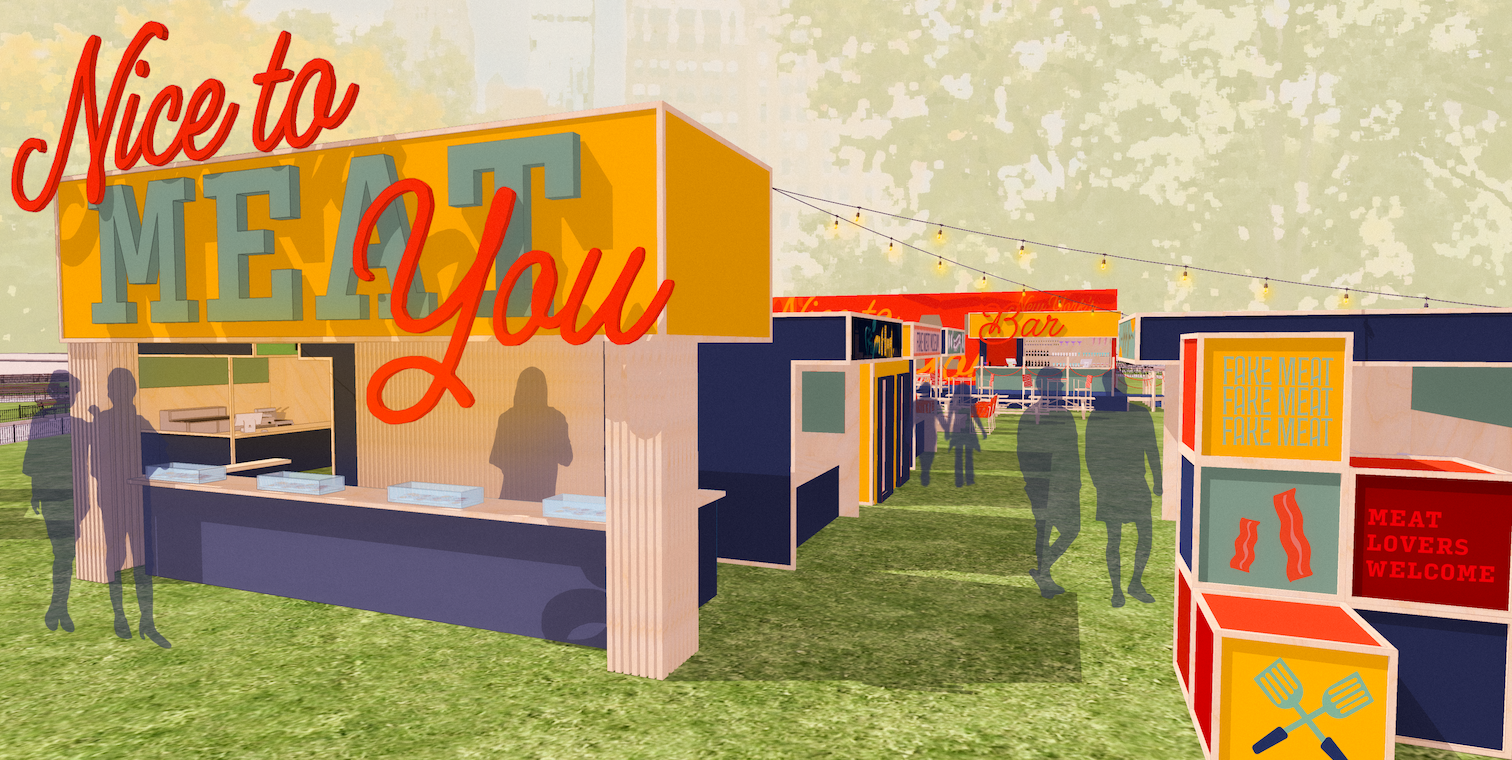
I originally looked at many meat packaging designs and often meat is sold wrapped up in rectangular brown paper packages tied up with string. This influenced my decision to use a cursive typeface to contrast a strong rectangular typeface.


Banner designs for activity booths.

Mural design for behind bar.

Colour selection and an accessibility study of colours to influence how the most essential text is used so key information is available to those with low-vision.
Booth Selection
I selected vendors that featured an array of types of cuisines and local restaurants that are creative in how they cook with meat alternatives. I also included booths that featured the leading mass manufacturers and developers of fake meat in the supermarket. The idea is that people can try all sorts of types of fake meat and see if there is something that suits their specific desires.


Activity Design
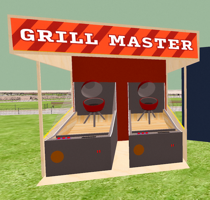
As discussions around the meat industry can often be heated, I wanted to provide a welcoming space for these conversations to take place and activities that would provide a break from such discussions. There are sandwich-meat-looking coasters with conversation starters written on them. Activity booths include, a meatball-inspired ski-ball game, a game where you see how many patties you can flip into a BBQ using a spatula, a mini-museum showing some less-than-desirable historic versions of meat alternatives and more.

Structural Design
Building off of the rectangular influence of packaging and organic, decorativeness of string I brought a lot of hard rectangular structures into my market design. I was also influenced by pop-up Public Works markets that exist in New York City. I visited several Christmas markets to ask about how vendors like the size and shape of their design. Some vendors expressed a desire to have space to walk behind the booths, which I implemented into my floor plan.

Bird’s eye view of market experience.
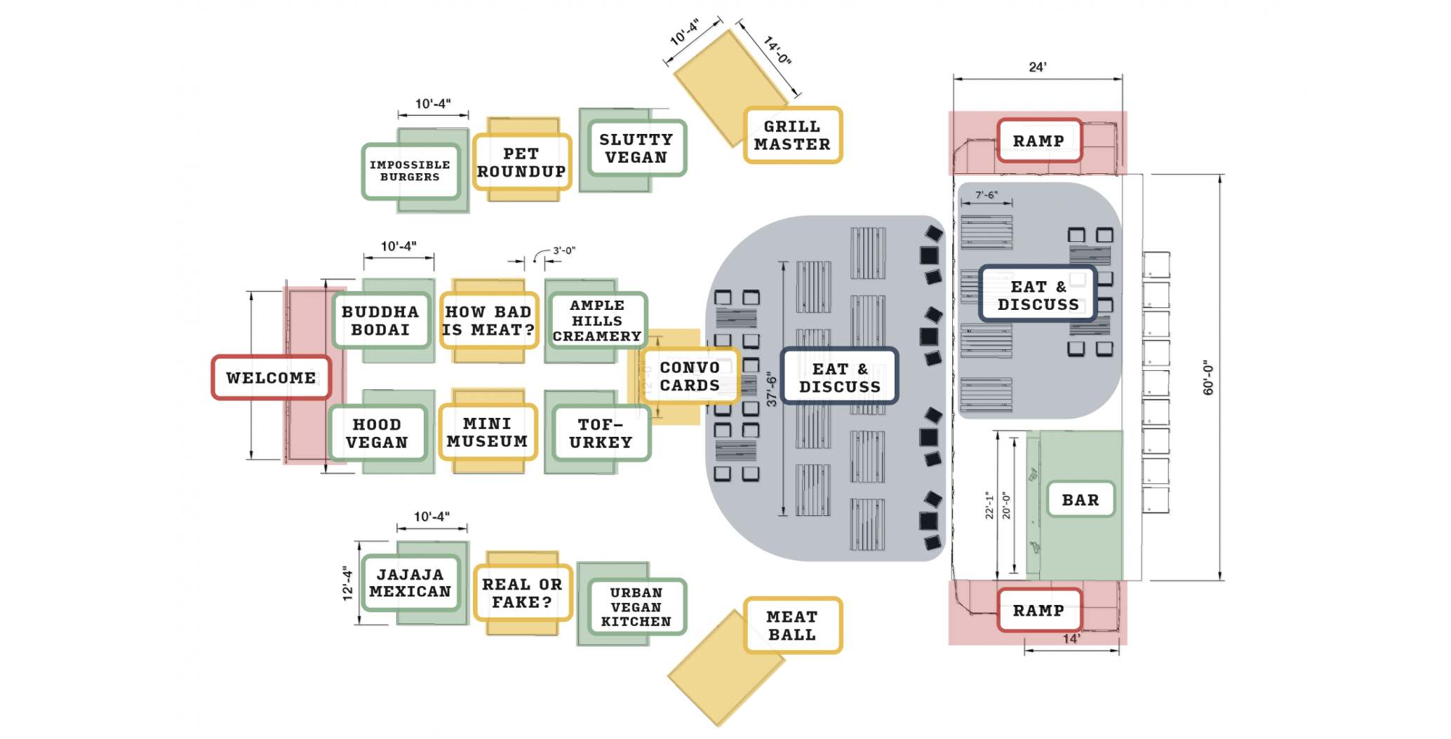
Floor plan and map for specific vendors.

Front and back elevations.

Bar at the back of the market where adults can purchase beverages or eat their purchased food.
View of seating for eating and conversations.
Side entrance of the market.

Branded stickers for labeling self, tote bag and take-home conservation cards.